
Logos are everywhere—on your screen, your clothes, your favorite products. They are essential branding tools, helping businesses establish their identity and stand out in a competitive market.
A strong logo should be memorable, versatile, and reflective of the brand’s personality. Whether it’s an eye-catching icon, a bold wordmark, or a combination of both, the right logo creates a lasting connection with customers.
When designing a logo, consider the different styles available. Some rely on symbols, others on typography, and many blend both for maximum impact. Choosing the right type ensures your brand is recognizable, professional, and adaptable across all platforms.
The 8 types of logos
- Wordmarks/logotypes
- Letterforms
- Lettermarks/monogram logos
- Logo symbols/brand marks/pictorial marks
- Abstract logo marks
- Mascots
- Emblems
- Combination marks

1. Wordmarks: Simplicity with Impact
Wordmark logos, also called logotypes, are a clean and straightforward way to represent a brand. They focus solely on the business name, written in a carefully chosen font or a custom typeface. While this may seem simple, every detail—from spacing to font weight—plays a role in making the logo memorable. As Steve Jobs put it, “Simple can be harder than complex.”
If you’re considering a wordmark for your brand, you have two main choices:
🔹 Custom Typeface: Brands like Coca-Cola design their own unique typography, ensuring their logo is one-of-a-kind. However, this approach requires time, skill, and a strong commitment to the brand’s identity.
🔹 Premade Fonts: Many companies select an existing font that reflects their brand’s personality. For example, a sleek sans-serif font works well for modern brands, while a bold or script font can add character. You can also experiment with capitalization, color, or special symbols to make the design stand out.
When Should You Use a Wordmark Logo?
If your brand name is distinctive, catchy, or easy to remember, a wordmark is a great choice. It helps establish instant name recognition, especially for newer companies trying to build a presence.
Examples: Google, Coca-Cola, Subway, LinkedIn.

2. Letterforms: The Power of a Single Letter
A letterform logo is a minimalist logo that consists of just one letter, usually the first letter of the company’s name. Many brands use letterforms as part of a broader branding strategy, often accompanied by a full-wordmark version of their logo for versatility.
One of the key advantages of letterform logos is their scalability. Because they are small and simple, they remain clear and recognizable even at very small sizes, making them ideal for:
✔ App icons
✔ Favicons (browser icons)
✔ Social media profile pictures
✔ Merchandise and product branding
When to Use a Letterform Logo
Letterform logos are an excellent choice for brands that already have strong recognition, as their audience can easily associate a single letter with the company. For businesses with long or complex names, a letterform logo simplifies branding and enhances memorability. Additionally, large corporations undergoing rebranding efforts often adopt letterform logos to create a more modern and streamlined visual identity. Brands that prioritize minimalism also favor letterform logos, as they provide a clean, sophisticated look while maintaining strong brand presence.
Examples: Facebook, McDonald’s, Netflix and Pinterest, Uber and Beats.

3. Lettermarks (Monogram Logos): Simplified Brand Recognition
Lettermarks, also known as monogram logos, are typography-based logos that use a brand’s initials instead of its full name. Many well-known companies, such as JBL and IBM, LG, rely on lettermarks because their full names are too lengthy for everyday use. Instead of saying “James Bullough Lansing” or “International Business Machines” or “Lucky-Goldstar,” people naturally refer to these brands by their abbreviations, making monogram logos both practical and memorable.
When designing a lettermark logo, typography plays a crucial role. Brands can opt for a custom typeface or choose an existing font that reflects their identity. Elements like kerning (letter spacing), width, weight, and style (bold or italic) should be carefully considered to create a cohesive, recognizable design.
When to Use a Lettermark Logo
Lettermark logos are ideal for industries where abbreviations are common practice. If your company has a long name and you want a shorter, more memorable brand identity, a lettermark is a great solution. However, before finalizing your abbreviation, ensure it is easily understandable and does not unintentionally spell something inappropriate. Testing it with your target audience can help avoid any misinterpretations.
Examples: JBL, IBM, LG, CNN, HP.

4. Logo Symbols (Brand Marks/Pictorial Marks): A Visual Identity
Logo symbols, also known as brand marks or pictorial marks, are graphic icons, symbols, or images that visually represent a brand’s identity. These logos typically depict real-world objects, making them easily recognizable. The best pictorial logos are so well-designed that people instantly associate them with the brand—think of the Apple logo or Twitter’s bird.
When choosing a pictorial mark, it’s essential to consider what image best represents your brand. Some brands opt for literal symbols related to their name, such as Apple, while others choose imagery that conveys their values—Twitter’s upward-facing bird, for example, symbolizes freedom and limitless communication.
For newer brands, selecting the right logo symbol can be challenging. Since businesses evolve over time, the chosen image should be versatile enough to grow with the brand. A common strategy for emerging companies is to incorporate their brand name alongside the symbol (as seen in combination marks) until the logo alone becomes instantly recognizable.
Another key consideration is timelessness. While it may be tempting to follow design trends, a logo should have lasting appeal. A trendy logo may become outdated quickly, forcing a rebranding effort sooner than expected.
When to Use a Logo Symbol
Logo symbols are ideal for brands aiming to establish a strong visual identity, as they create an immediate and lasting impression. They are particularly effective for international businesses since symbols are universally recognizable, making them easily understood across different cultures and languages.
Additionally, this type of logo works well for companies that want to evoke an emotional or conceptual connection with their audience, allowing the brand to communicate its values without words. Once a company achieves high visibility and strong brand recognition, the symbol alone can serve as the primary brand identifier, reinforcing its presence without the need for accompanying text.
Examples: Apple, SBI, Windows,
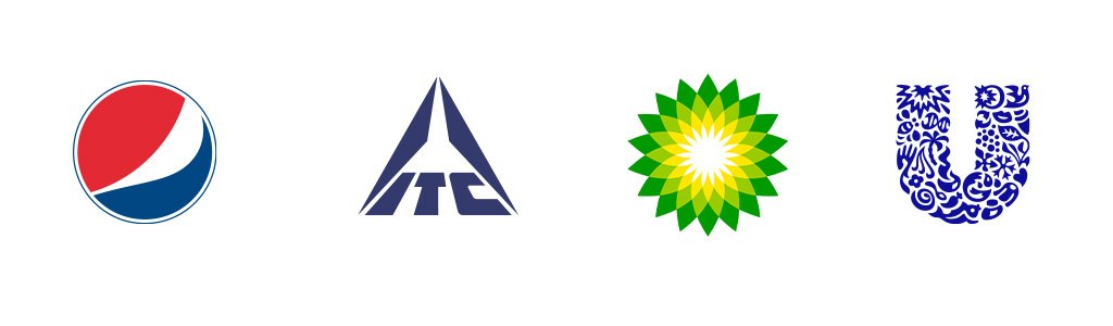
5. Abstract Logo Marks: Unique and Conceptual Branding
Abstract Logos: Creativity Without Limits
Abstract logo marks take a different approach by using shapes, forms, and symbols to express a brand’s identity without directly representing a real-world object. Unlike pictorial logos that rely on recognizable images, abstract marks give brands the freedom to create something truly unique.
The key to designing an effective abstract logo is to capture the essence of the brand in a simple yet meaningful form. Take Airbnb’s logo, for example—it’s more than just an “A.” It cleverly combines elements of a location pin and an upside-down heart, symbolizing connection, belonging, and hospitality. This creative approach allows abstract logos to convey deeper meanings while maintaining a sleek and modern appearance.
When to Use an Abstract Logo Mark
Abstract logo marks are most effective when a brand has a well-defined identity and a clear message to convey. Since these logos rely on symbolic and conceptual designs rather than literal imagery, it’s important to ensure they align with the brand’s values and vision. They are particularly useful for global businesses whose names may not translate effectively across different languages, allowing for a universally recognizable brand presence. If uncertain about the effectiveness of an abstract logo, conducting usability testing can provide valuable insights into how well it resonates with the target audience.
Examples: Pepsi, ITC, BP, Unilever

6. Mascots
Mascot logos incorporate illustrated characters that visually represent a brand, creating a relatable and engaging identity. These characters, whether based on real people, animals, or entirely original designs, help bring a brand to life, making them highly effective for companies that aim to build strong emotional connections with their audience. Mascots are particularly popular in industries catering to children and families, as they add an element of fun and playfulness that resonates well with younger audiences.
When to use mascots:
Mascots are ideal for brands that prioritize storytelling and interaction, especially on digital platforms and in animated content. They work well for social media marketing and advertising, where visual engagement is crucial. However, since mascots tend to have intricate designs, brands should consider creating a simplified version for smaller applications to maintain clarity and recognizability.
Examples: Colonel Sanders by KFC, Amul with Girl, Nirma Girl
7. Emblems
Emblems, or badge logos, are a classic style of logo design that blends text with symbolic imagery, often resembling crests or seals. These logos exude a sense of tradition, heritage, and prestige, making them a preferred choice for institutions such as universities, sports teams, and coffee brands. While traditionally intricate and ornate, modern adaptations of emblems favor cleaner lines and minimalist vector illustrations for a contemporary aesthetic.
When to use emblems:
Emblem logos are ideal for brands that want to establish a strong, authoritative presence and communicate a sense of history or authenticity. They also provide space for incorporating slogans, enhancing the brand message. However, due to their detailed nature, emblems may not be as versatile when scaled down for smaller applications. To ensure adaptability, businesses can create a simplified version for use on favicons, business cards, or digital platforms.
Examples: Starbucks, Stella Artois, Warner Brothers, BMW.

8 .Combination marks
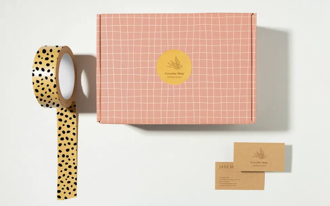
A combination mark is a powerful branding tool that integrates images with text, offering the best of both worlds. This type of logo may pair an icon with a wordmark or a mascot with a letterform, allowing for flexible branding across multiple touchpoints. Many brands opt for combination marks as their primary logo while using the elements separately when needed, ensuring a consistent and recognizable identity.
One of the biggest advantages of combination marks is their versatility. They can be customized for different platforms and marketing materials while preserving a unified look. For example, Lacoste’s website showcases its full logo, while the brand’s apparel and accessories often feature just the green crocodile emblem.
When to use combination marks:
These logos work exceptionally well for emerging brands looking to establish recognition. The combination of text and imagery makes it easier for consumers to associate the logo with the company’s name and purpose. Over time, businesses can rely on either the icon or wordmark independently while still maintaining a strong brand presence. Additionally, using a visual component alongside text enhances brand storytelling and provides instant context for new audiences.
Examples: Lays, Toblerone, Dominos Pizza, Burger King, Nike.
while preserving a core motif that ensures continuity across variations. This flexibility makes dynamic logos highly versatile and engaging.
A well-known example is Google’s ever-changing doodle, which modifies the familiar wordmark to reflect historical figures, holidays, and events while remaining instantly recognizable. Another example is Hillary Clinton’s campaign logo—a bold “H” that maintained its original structure while appearing in different colors and themes to reinforce her messaging.
What are some new types of logos and trends going into 2025?
Emerging Logo Trends for 2025
As we transition from 2024 into 2025, logo design continues to evolve, introducing fresh trends and creative innovations. Here are some of the key logo styles that will define the year ahead:
- Dynamic Logo Pairings – More brands are adopting flexible logo systems that seamlessly adapt to various platforms while maintaining brand identity. Meta’s infinity symbol, which shifts colors and forms across its suite of apps, is a prime example of this adaptive approach.
- Eco-Conscious Design – Sustainability remains a priority, influencing logos with natural elements, organic shapes, and earthy color palettes. Expect health, wellness, and environmentally focused brands to embrace this trend even more.
- 3D and Depth – Flat designs are making way for more dimensional logos with subtle gradients and depth effects. Google Chrome’s logo evolution demonstrates this shift towards more immersive branding.
- AI-Influenced Design – With AI becoming more integrated into design, logos are adopting futuristic, tech-forward aesthetics. OpenAI’s clean yet modern identity exemplifies this direction.
- Artistic Typography – Playful, custom, and imperfect typography adds personality to logos, aligning with the current trend of brand authenticity and individuality.
- Heritage with a Modern Twist – Classic logo elements are being reimagined with contemporary design updates. Burberry’s revival of its equestrian knight with a sleek, minimalist touch showcases how heritage can meet modernity.
Create Your Own Logo
No matter which logo style you choose, thoughtful design is key to building strong brand recognition. A well-crafted logo fosters trust and positive associations with your brand over time. The Wix Logo Maker allows you to explore different styles, typography, colors, and layouts—helping you design the perfect logo that reflects your vision. Get creative and start designing today!
FAQs on Types of Logos
- What are the types of logos?
Logos include wordmarks, lettermarks, pictorial marks, abstract logos, mascots, emblems, combination marks, dynamic logos, and animated logos, each serving unique branding needs. - Why is the right logo important?
The right logo builds brand identity, boosts recognition, and effectively conveys a brand’s values, helping it stand out from competitors. - When should a business use a specific logo type?
It depends on brand recognition, industry norms, and audience. Established brands may use lettermarks, while startups benefit from combination marks. - Where are different logos used?
Wordmarks and lettermarks suit corporate branding, pictorial marks work for apps, and mascots/animated logos thrive in marketing and entertainment.
How can a business create a great logo?
Define brand identity, pick a fitting style, experiment with design elements, and test across platforms for versatility and impact.